
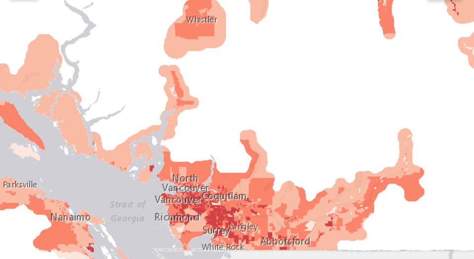
The COVID-19 virus does not impact all towns or neighbourhoods equally. That is one of the main takeaways of new "COVID-19 Risks in British Columbia’s Neighbourhoods" maps created by a team of researchers at Simon Fraser University.
Geography professor Valorie Crooks and fellow researchers created the three interactive maps identifying COVID-19 risks in various neighbourhoods across B.C., including those in Squamish.
"The darker the colour, the more significant the risk," Crooks told The Chief.
The three maps show personal risks, place-based risks and overall vulnerability to risks.
"For a place like Squamish, it is interesting, because there's a close proximity, obviously, to a place like Whistler that has a whole bunch of risks inherent with it, because of the nature of the tourist industry," she said. "And so, that brings a lot of risks into that area as a whole, that you can see being picked up in Squamish."
The maps are designed to assist policymakers in identifying areas most in need of additional support to prevent and manage outbreaks.
What makes a place riskier?
One of the most important messages of the map project is that the most important decision-makers in the pandemic are individuals.
"Because you have all this policy-level discussion and dialogue happening, but it is an individual person's decision as to whether or not they are going grocery shopping, or whether or not they are going to go to that restaurant and not wear their mask, or whatever it might be... It is those very small scale decisions that are determining the spread of COVID-19 and the outcome of this pandemic."
The maps aren't meant to help residents to determine where they should go to say, walk their dog or buy groceries, Crooks said, but instead, they offer more of an overview of risk.
"This kind of work is to support policy-making decisions, even in relation to vaccine roll-out," Crooks said. "You can imagine as we begin to bring vaccine campaigns on board, our province is quite large. We aren't going to have one day where everybody is vaccinated. And we are going to have clinics that actually move, for sure, including the personnel that are involved with administering the vaccines. So, this kind of project with the maps can help those people who are involved with helping those campaigns to decide which communities should come before other communities because they happen to have higher risks in place," she said.
Factors considered to assess risk include the use of public transit, working outside the home, being non-English speaking, living in a large or crowded household, experiencing socioeconomic disadvantage or being employed in a high-risk industry.
The maps also consider place-based risk factors of communities such as the locations of long-term care facilities or prisons.
"You can see that the way that we should understand risk within a place, even a smaller city or town like Squamish, it is not even. We can see differentiation within the city or town. That is important as well," she said.
Crooks noted that at this point in the pandemic, people are a bit numb to all the information they are receiving, and it is often from a very bird's eye view of the issue, not a community view.
"And so, our work helps bring granularity to the discussion that hasn't happened so far. Where you can actually see, it is not an even playing field across the province, within health authorities or within municipalities."
The models are based on Statistics Canada data and publicly-available addresses. Public health professionals across the province also provided input.
Crooks stressed that the maps show risk from a hypothetical or theoretical perspective.
The policy measures that have been in place to reduce risk haven't been worked into the modelling.
When more detailed data on COVID-19 cases is released to show exactly where cases developed, an overlay of the risk maps with cases could show how policy measures worked or didn't, Crooks said.
No matter what the community, looking at the maps shows that there are discernable differences with the risks that are in place within cities or municipalities or within health authorities, she said.
"That actually shows us that taking that blanket one-strategy-fits-all type of solution to the policy measures that are being put in place, may not actually be the most effective way forward."
The maps project was funded by a COVID-19 Rapid Response Grant from the Michael Smith Foundation for Health Research and the BC SUPPORT Unit.
What is next
In addition to adding more data when available, researchers have two other models planned for assessing risk to COVID-19, including one that would look at factors such as gender, and the other that would look at people's risk in relation to their proximity to an ICU.


