I've worked at the Citizen for nearly 11 years, but that is only a fraction of the experience my mentors have. I consider myself incredibly lucky to have learned from people who made the Citizen what it is today.
People including Denis Ruth, Billy (Bill) Fowlie, Lynn Richards and Gail Garrison - who all worked in my department when I first arrived - and had a combined employment at The Citizen of more than 100 years. They were experienced, hard-core newspaper people, with knowledge of the industry few other people will have.
They are why I love the newspaper industry so much and why I continue to love my job as a graphic and layout designer. Being asked to create a new logo for The Citizen was a big deal for me.
This business is not just a pay cheque to me, it's a career and a part of my life where I've gained many great friends and even found the love of my life.
I wanted to do The Citizen's 100 years proud.
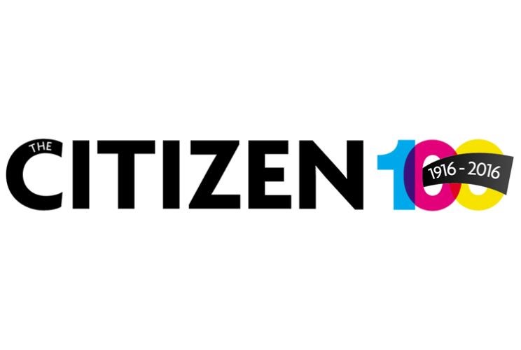
My first idea was simple, it needed to reflect our industry and not just be pretty. It was based off the colour palate used by our printing press, a simple CMYK (cyan, magenta, yellow and k for black) in the form of 100 to celebrate our 100th year in business, add in our familiar Citizen logo, separated by another printing press classic, the grey bar (a gradiated bar in the different shades of grey used to ensure the greys on the press were either dialed up or down enough to print as true to the shades needed as possible). I loved my first shot at it.
I scoffed at our editor when he asked for variations, explaining to him that the way I designed it was purposeful, it didn't need changing (cue the designer ego kicking in), but I'm not the boss, so back I went to revise the logo in the ways suggested.
I got over my bruised ego pretty quick, as I realized this wasn't about me and my abilities as a designer, but about making something all the cooks in the kitchen could be proud of.
It was about taking all the ideas and criticisms and using them to create something that reflected our industry, that served our newspaper going forward, that reflected on who we were, what we are now, and where we want to go. My original idea of using the CMYK colour palate and the grey bar are still heavily represented in the 100 part of the logo but I feel the noticeable difference to what you see now is the lack of our familiar Citizen logo.
Our publisher, Colleen Sparrow, wanted a fresh look for our logo, one that could be used well after the 100th anniversary has passed.
So we freshened it up, dropped the Prince George, and there you have it. The 100 stayed with the same concept I started out with using CMYK, but also had a facelift with a suggestion from our advertising manager, Dave Smith, to turn the zeroes into camera lenses as a nod to our photographers, who help make the newspaper more visual, exciting, and tell the stories sometimes better than words can.
The 100 goes purposefully from black, to gray, to CMYK, as a representation of our newspaper's journey from black and white to the colour versions you see today. While I kept the true CMYK colours in the last of the zeroes, variations were added to represent the colourful and diverse community of Prince George, a place I am proud to call home and a place that The Citizen proudly serves.
It took many weeks and many cooks in the kitchen but what I ended up designing is something I am immensely proud of. Through the process I've come to realize that sometimes I need to check my ego at the door, not everyone will see the purpose in what I've created, and not everyone will agree on what it should look like.
What's most important to me is that I got to be a part of this milestone.


