Although there is clearly truth to the concept of there being bad art versus good art, part of art's universal appeal is its subjectiveness. One person's interpretation of a piece of art is so open for variation from another person's, it was the subject of Theatre North West's first play of the year.
So too must we at The Citizen embrace the inherent controversy of artistic interpretation as we open a series of our own. The Alphabet Project has a start, and it is the letter A. That much is solidified in concrete fact.
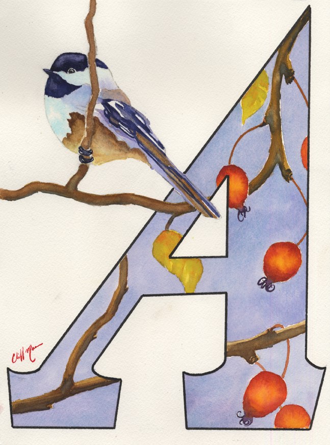
What kind of art should represent that letter, whom should commence such a labourious undertaking, and how it should be depicted all become judgment calls. That watercolour specialist Cliff Mann should be that commencement artist is easy to stand behind.
Yes, a number of others could have been assigned to the letter A and all the extra spotlight it casts, but Mann is certainly inside the circle of those able to carry that responsibility.
Flip through the below slideshow to view the Alphabet Project art and a link to each artist story:
Mann has earned and enjoyed a meteoric rise in reputation in the past few years, and reputation fits with literal artistic skill as a socks fit into shoes. He was a winner at the annual Prince George Art Battle event and went on to make the finals at the provincial Art Battle event in Vancouver.
Mann was, at the time, the Community Arts Council's artist-in-residence, which was a position he had to win with skill and hard work and it required more hard work to fulfill the obligations that come along with the post.
He was commissioned to paint an image he entitled Timeless View for the Historic Hoble Homestead's 100th anniversary, and that in turn got selected for the 2014 edition of Splash: The Best of Watercolor. He was also included in the Northern Art Initiative's 2013 calendar with painting called Silent Flight. His Studio 2880 exhibition in May called Bodies Of Water was a smash hit. He has become a popular name in retail art spots, as a private art teacher, and he has been called on for numerous high-profile commissions.
It led to being the inaugural artist for the Citizen's centennial initiative called The Alphabet Project, done in conjunction with the Community Arts Council. As the CAC's project co-ordinator, it was up to Lisa Redpath help co-ordinate the 26 artists needed, and in order to have a sense, herself, of how to approach that process she needed to have a template to work from. That needed an artist she had a level of trust with, and that past interaction brought Mann into the very first conversations that settled, eventually, on the letter A.
It also made Mann the first fan of the idea.
"We're showing the city what kind of talent we have here," he said. "It's not just the number of quality artists this advertises, it is showing all the unique mediums local artists work in. Each week, you never know what's coming next. That's kind of cool."
Mann applied his precision watercolour technique (as opposed to the swirls and plumes preferred by many watercolour artists) to the letter A three times, each one different in almost every aspect. He confessed he disliked articulating fonts, and here he was faced with that as the sole purpose of the art piece, so he wanted to exercise a spectrum of possibilities to himself before he submitted a final image.
"I know this isn't the first Alphabet Project to be done by a newspaper, so I deliberately didn't go searching for those others, I wanted a totally fresh outlook, just my own interpretation of the letter A," he said.
He would have been happy with any of the letters, the application of creative energy would have been the same. He considered it a privilege and applauded the Citizen for sharing the newspaper's centennial with the arts community in this way.
"As an artist, where else do you get to be front page news, in any town? And this is going on for 26 straight weeks. That's invaluable to the arts community," he said. "I worked hard to do something that was representative of my work, because I didn't think the front page was any place to be experimental. Doing a letter was enough of a stretch for me, I wanted to stay true to who I was."
Next week's letter B will be represented artistically by painter Anne Bogle.