
I've been asked to kick off a new feature called Behind the News here at The Citizen. It's a look between the lines at some of the ideas, processes and projects that we tackle in the newsroom.
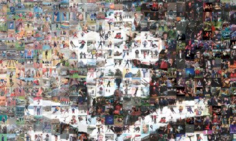
My job, with this inaugural column, is to detail the creation of the cover of the Friday, March 6 issue - which was a mosaic celebrating the City of Prince George's 100th anniversary (you can check out a full-size version of the mosaic at pgc.cc/PG100mosaic).
To start off, here are some stats:
There are 2,015 images in the mosaic;
I compiled an archive of 5,526 images to choose from (about 7.6 GB of data);
The program that compiled the mosaic took 15 hours to create the image.
As mentioned above, I did use a program to create the image - basically what it does is take a photo or graphic as the basis for the mosaic, and then it takes other images to recreate the original picture.
Other than the base image and the other images, the program needs to know how many images (or tiles) to use in the completed mosaic. In general, the more tiles that are in the mosaic, the better the representation of the base image.
For this project there were some pretty unique factors to consider when deciding the amount of tiles to use.
First off, newsprint is pretty porous and just eats ink which can lead to softer details if you're not careful, so I had to be mindful that the tiles were large enough so that the photos were recognizable.
Secondly, the size and shape of the tiles need to lend themselves to the image you're trying to recreate. I went through four or five shapes (from horizontal to square to vertical) to see which one would best show off the archive photos and combine to best remake the base image.
Finally, I decided to be a bit cheeky and specifically use 2,015 tiles, which just so happened to make square tiles (31 wide by 65 tall) and square tiles, luckily enough, were the best for showing the archive photos and the base image.
So, now to get all the materials together.
I wanted a base image with a large range of colours and brightness, because I figured that would give me a better chance at maximizing the photos in the archive I had created. (Unfortunately, due to time constraints, I was only able to include the last three years of Citizen photos into my archive.) I also wanted the image to evoke Prince George, and I quickly landed on an autumn shot from Fort George Park, looking East across the Fraser River. Then, because I wanted to keep the graphic elements as minimal as possible, I decided to put the City of Prince George's logo on top, rather than the city's more detailed 100th anniversary graphic.
That image gave a great range of colours and brightness, though it still took multiple 15-hour renders to get right. Should there be a little bit of the tree on the right? Should this city employee on the left of the shot be included? More sky? Less sky?
But I think I got it in the end, with about 2/5ths of the page with the tree, not too much sky, and no city employee (too much fine detail to reproduce).
Now, with the base image set, my archive compiled and the amount of tiles selected it was time for the program to take over for a bit.
The way that the program works is that it breaks your base image down into the tiles you've selected and then it does an analysis of each tile's colour, brightness and contrast. Not only is it looking at average levels, but it also looked at dominant shapes within the part of the base image captured in the tile. The program then scans through the archive and finds images that best match those averages and shapes, and as it scans through the archive it will continually update a tile as it finds a closer match.
And that is why you want a very large archive to be pulling from. My first tile had 5,526 options to get a perfect match, but my last tile only had 3,512 options. But then you need to take into account that a large proportion of the images wouldn't be at all acceptable in a specific tile (we get a lot of shots with blue sky and shots of people's faces, which skewed the archive). Ideally I would have had an archive four-times larger (about 20,000 photos, 30 GB of data) and would be able to pare out similar shots (we quite often take multiple shots of the same subject).
So, on Thursday afternoon, after the program rendered all night, I ended up with an almost done mosaic. I printed it out and proofed it: looking for duplicate photos, poor representation, bad cropping of the photos to fit the tiles and anything else that caught my eye.
I then marked each one of those tiles and then manually updated them, going through my archive to find better photos.
Once that was complete it was time to get it on our front page and top it off with a banner celebrating the city's 100th anniversary (1915 - 2015) and a caption explaining what it was.
I had a lot of fun on this project. There are things I would do differently given the time and resources, but I am proud of being able to bring this project from concept to publication in under a week.
Happy birthday Prince George, here's to 100 more.
Tyler Sabourin is an associate news editor at the Prince George Citizen and has won a 2014 CCNA award for Best Photo Illustration.


