Like a train whistle in her head, calling across the fields and forests of time, came the letter R to Laura Chandler. RrrrrrrrrrrRrrrrrrrr.
It was a blaring call emanating out of her family lineage and out of her city's history. It was more than a letter of the alphabet, it was a sound that was at once plaintive and painful, industrial and beautiful. And especially, as she put her mind to her image in the Alphabet Project, it rang true.
"On a personal level, my mother's family worked for the railroad," Chandler explained. "Her father F.H. Keefe, like many others, actually helped to build the railroad as a very young man and eventually worked his way up to the position of general manager of CNR's Western Division. Two of his sons, George and Warren, followed in his footsteps in various jobs as conductor, supervisor and stationmaster respectively. I always found it interesting to hear stories of their life growing up and living in station houses in various western locations. I can remember being on my grandfather's business car after it arrived in Thunder Bay from the west. That was pretty exciting for me. I would like to dedicate this piece to my grandfather, his family and a bygone way of life that was so important in so many ways to all of us as Canadians."
The Alphabet Project is designed to be an eye through the keyhole of art, back in time or ahead in future. It was meant to be a 26-letter celebration of language and art - a fitting commission by the Prince George Citizen as it turned 100 years old. The Community Arts Council helped arrange the artists of the region with a randomly selected letter. After that, they were on their own to come up with whatever their minds individually conjured for this collective project that would be revealed one letter at a time over 26 consecutive weeks.
Flip through the below slideshow to view the Alphabet Project art and a link to each artist story:
Chandler applied to be one of the artists but didn't find out about her successful selection until it was already underway. Hoping to be selected, but not knowing which letter it would be, she came up with initial ideas for all letters, so when the R reveal was made, she was already underway.
As with most substantial art, she actually got underway on her piece all through the living of her life. Having lived beside Lake Superior, on the prairies, beside the ocean, and now in dense forests amid the mountains, her view of the world has always been framed by the enormity of nature. That came percolating through in her making of the R painting.
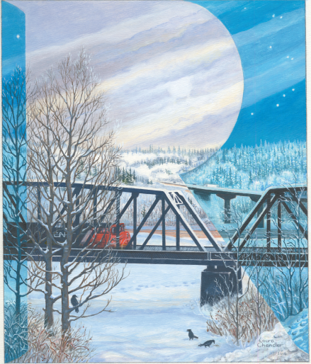
"I thought that the traditional First Nation's meeting place at the junction of the Nechako and Fraser Rivers was an important geographical area in relation to the development of Prince George through out its history. A current view of this would make an excellent setting," she said. "The title of my piece is River, Road and Rail suggesting that each is significant to the development of our city. All three can be seen from this viewing point. The river, of course, was one of the earliest ways to access Fort George and the north. The use of steamships and later roads and ferries was the common means of travel. Once the CNR Bridge was built in 1914 there was much easier access to the town and it ensured its continued growth. The railway was not only significant to the development of our city but to the connection of B.C. to Canada, promising a united Canada. In 1915 Fort George became Prince George. This is why we had our wonderful celebrations and the Canada Winter games here in 2015. Just one year later in 1916, The Citizen newspaper was established, helping to keep the community informed of local, Canadian and world events."
In deference to newspapering, the R itself, as depicted in her painting, mimics the Times Roman font used so often in the printing industry over time.
The R also casts a contrast between shadows and light, and, like that keyhole we spoke of earlier, looks like one that the public itself might be peeping through, looking at our own world, our own natural surroundings and way of life - just like newspapers do every day.
Even the birds in the painting have meaning. They are, of course, ravens, which suggest the most common of local birds and one with deep meaning to the ever-present First Nations of the region. No matter what trains may go by or bridges that may be built over rivers, our community's aboriginal founders are still hereabouts.
"The inclusion of day and night, symbolizes the passage of time and history," Chandler said.
"It is very similar to a technique that I sometimes use that has images within images. The colour is dominantly in various blues and neutrals with the CNR train being in a focal point in red-orange for contrast to the cooler colours."
As a working artist and a teacher of art (privately and in schools), Chandler has taken up several mediums throughout her career. She can do abstract, she can do photography, and she can blend styles and media together. She said she was actually feeling an experimental phase coming on, but wasn't yet sure what that might look like.
"My usual artistic process includes a loose drawing and under painting in an impressionistic style and is complementary in colour to the final overall main body of colour in the painting. As I build up the layers in either watercolour or acrylics, the forms and textures become stronger. The challenge of creating detail is what makes a painting interesting to me. I love to take the time and the care to make the piece look realistic but not necessarily photorealistic. If you look closely you'll see much of my work is based on impressions. For me sharper crisp edges are needed for architectural forms and other man made things. One can be a lot freer with natural organic subjects."
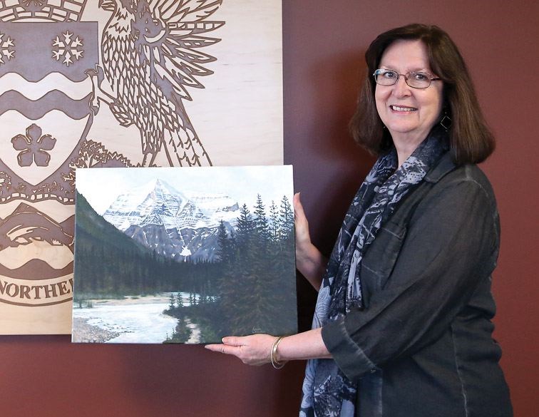
She has taken part in other high-profile art projects in the city. She created one of the spirit bears that dot the town (hers is on display at the Coast Inn of the North). She took part in the city's banner program that jazzed up the Hart and Cariboo Highways through the city. She has been featured in exhibitions at the Two Rivers Gallery and Studio 2880, Art Space and Groop Gallery, among other viewpoints. Hers is the art currently on display throughout the fifth floor of city hall.
"I would like to thank the Citizen for this opportunity to be a part of this project," she said of her latest creative inclusion. "It is very special for me to be recognized for contributing to our art scene. The Citizen has shown support and understanding of the importance of art to its community. The newspaper is a combination of several art forms in itself, all its literary aspects as well as cartooning, photography, and graphic design. Art is as much part of the news as any other topic or event... maybe in even more so in light of the last statement.
"Visitors often discover the character of a community and its culture by the work of its visual artists. Most cities celebrate significant events by unveiling an art piece or project to help memorialize it. Prince George takes second place to none in regards to this and in many other areas. The paper has initiated the Alphabet Project to help commemorate its 100 years of service to the community, a very special historical moment in our city's life."